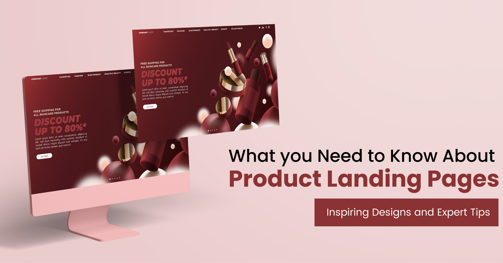
What you Need to Know About Product Landing Pages: Inspiring Designs and Expert Tips
When it comes to digital marketing, ensuring an optimal customer journey is crucial and that begins with effective online advertisements and SEO strategies. However, what occurs when potential customers click on your advertisement and are directed to your product landing page?
At this critical juncture, it becomes imperative that your landing page is concise, well-organised and captures their attention instantly. Without a captivating landing page, all your diligent efforts in online advertising might prove futile.
Click Here – Free 30-Minute Strategy Session
Be quick! FREE spots are almost gone for this Month
Free Quote
In this blog, we will delve into the art of crafting a high-performing product landing page that yields tangible outcomes.
Role of a Product Landing Page
A product landing page refers to a dedicated webpage within your website that is specifically crafted to promote and showcase a particular product. Its primary objective is to convert visitors into customers by equipping them with the essential details needed to make an informed purchasing decision.
It is important to distinguish landing pages from homepages, as homepages serve as the main entry point to a website, whereas landing pages are designed with a singular focus on converting visitors into leads or customers, emphasising a specific product or offer.
Product landing pages serve as effective tools for:
- Driving traffic from various sources
- Introducing new products, providing potential buyers with additional information
Product landing pages serve as the initial impression that potential customers have of your brand, necessitating the inclusion of comprehensive information to convince and convert them.
Learn More: Optimising Landing Pages for SEO
What are the Essential Elements of a Product Landing Page?
To transform visitors into valuable leads or clients, it is essential to incorporate specific crucial elements into your product landing page. While you have the flexibility to add your unique touch, these core building blocks should form the foundation of a strong landing page design.
- Headline and Hero Section: The headline and hero section of your landing page are of paramount importance. This section should captivate visitors and convey the benefits they will gain from your offering. A compelling headline sets the tone and entices readers to explore further.
- Features and Benefits: Highlight the key features and benefits of your product. Clearly articulate how it can solve customers’ problems or fulfil their needs. This section should emphasise what sets your product apart and why it is valuable to potential customers.
- Product Images and Videos: Visual elements such as high-quality images and engaging videos are powerful tools to showcase your product. Use visually appealing content that accurately represents your offering and helps users visualise its usage or impact.
- Reviews and Testimonials: Include authentic customer reviews and testimonials to build trust and credibility. Positive feedback from satisfied customers can greatly influence potential buyers’ decision-making process.
- Clear Call to Action (CTA): Guide visitors towards taking the desired action with a prominent and compelling call to action. Make it clear and persuasive, prompting users to make a purchase, sign up or engage further with your product.
- Frequently Asked Questions (FAQs): Address common queries or concerns through a well-organised FAQ section. Anticipate potential questions that users might have and provide clear and concise answers to alleviate any uncertainties.
Regardless of the landing page builder you choose, use the following mentioned building blocks to create a fundamental framework for all your product landing pages.
How a Product Landing Page Can Help Your Business?
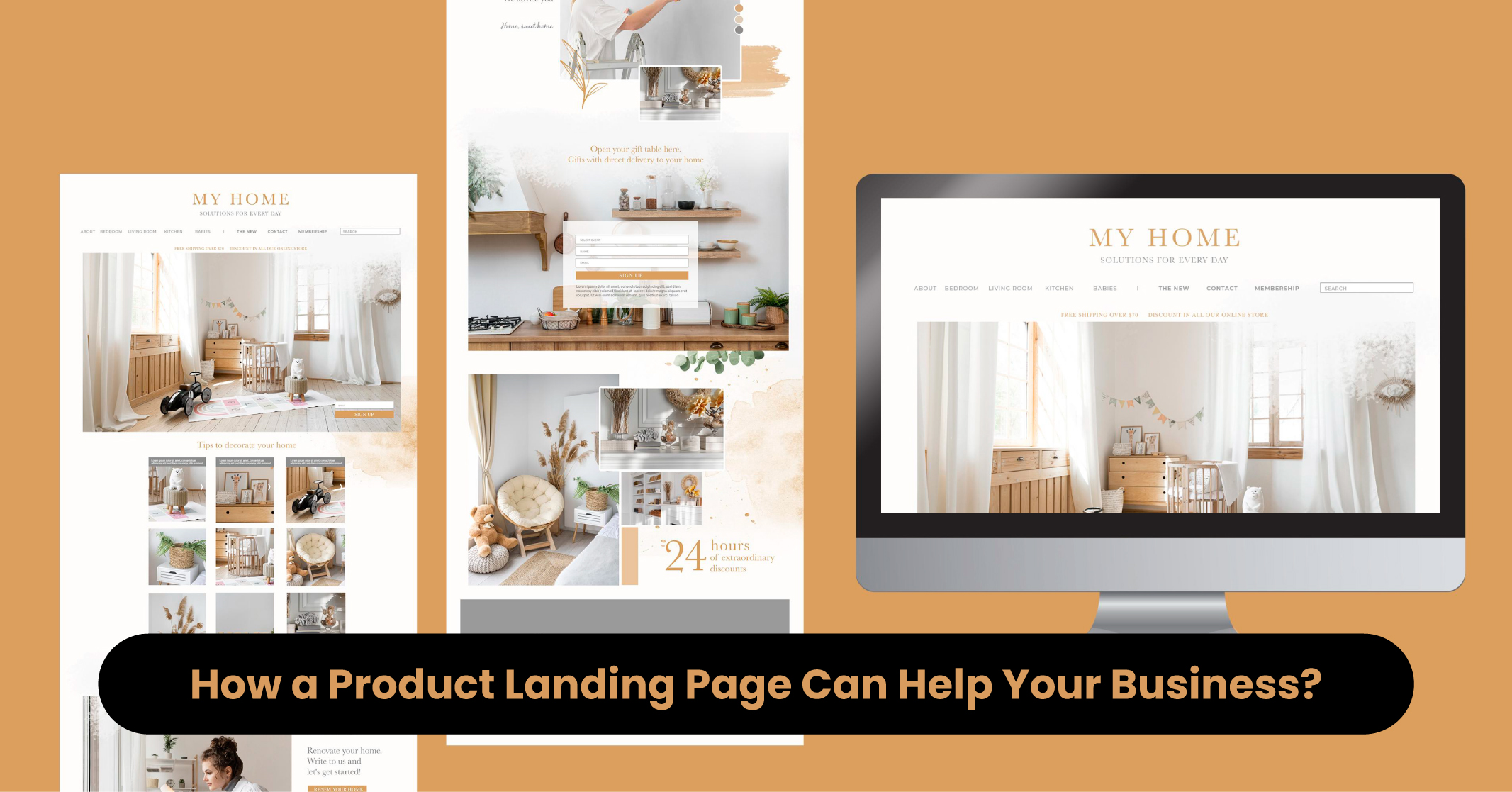
The section dedicated to features and benefits is where you truly begin the persuasive aspect of your pitch. It is crucial to elucidate:
- What makes your product/service different?
- Why should customers choose your brand over others?
Overall, the landing page must provide a comprehensive overview of all the features and corresponding benefits. Remember that it is not solely the features themselves that drive sales; it is the benefits derived from those features that truly matter to your customers. Avoid the pitfall of solely focusing on the impressive capabilities of your product.
What To Do?
Your customers are less interested in what your product can do in isolation and more concerned with what it can do for them. For each feature, ensure you address the question: “So what?” Clearly articulate how each feature directly translates into a meaningful outcome for your customers.
- Efficiently address the problems your product solves
- Emphasise how it simplifies or enhances your readers’ lives.
- Speak directly to their pain points and demonstrate why purchasing from you will be a worthwhile investment.
Craft Impactful Content with These Powerful Landing Page Ideas
If you have basic landing page designs in mind, all you need is to incorporate other visual elements to present your brand in the best possible way.
Here is a list of important things you need to do:
- Utilise compelling images and videos on your product landing page
- Provide potential buyers with a sneak peek and offer detailed explanations of its features
- Leverage high-quality images or videos that demonstrate the craftsmanship and quality of your items
- Incorporate screenshots or video walk-throughs can be valuable in illustrating how the product works and showcasing its features
- Add online reviews and testimonials to establish trust with potential customers
- Include a FAQ section to address any lingering concerns and provide additional details on your offer or product.
While preparing the product landing page templates, make sure the content is clear and to the point. Don’t get too wordy; keep your answers short. Try to incorporate visuals to explain complex concepts.
Learn More: What are Pillar Pages?
Product Landing Page: Digital Marketing Trends
With over 50% of website traffic originating from mobile devices, it is crucial to optimise your product landing page for the best mobile experience. Failure to do so may result in visitors quickly bouncing off without taking any action.
Furthermore, Google prioritises mobile-friendly pages when ranking search results. Consequently, if your landing page lacks mobile optimisation, it may not appear in search results, negatively impacting your visibility and potential traffic.
What Does It Mean?
Fortunately, designing landing pages with mobile users in mind doesn’t have to be a complex process. Making simple adjustments such as using larger fonts, reducing text length and ensuring buttons are easily clickable on smaller screens can make a significant difference.
Points To Know: Unlike their desktop counterparts, mobile product landing pages cannot accommodate the entire process on a single page due to the limited screen size. Therefore, designing for mobile requires a streamlined approach that emphasises presenting the most crucial information upfront, ensuring that visitors do not miss out on the value you are offering.
Best Practices for Creating Landing Page Templates
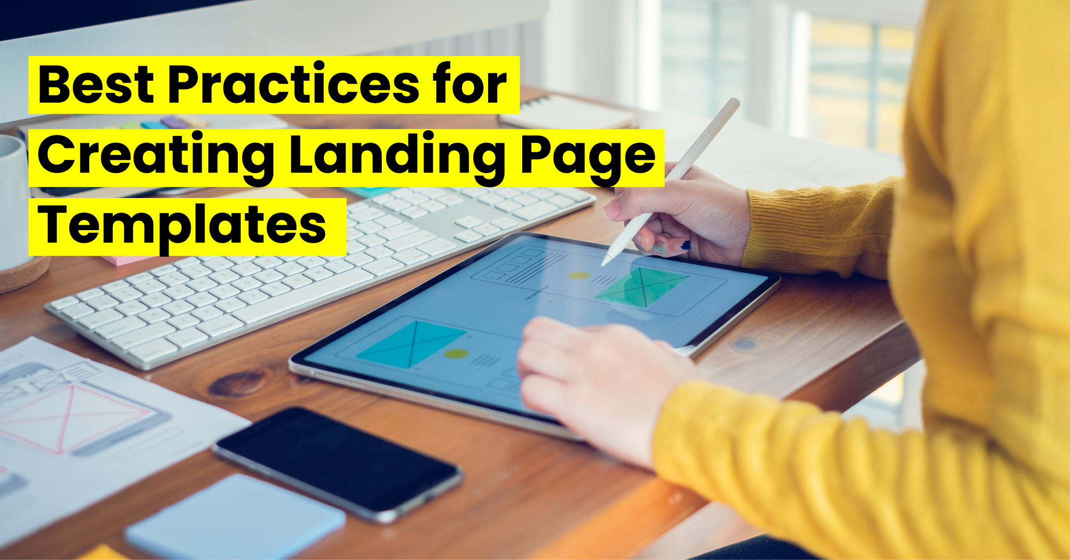
Creating impactful product landing pages requires tailoring your approach to specific industries. Here are industry-specific tips and strategies to help you create high-converting landing pages that resonate with your target audience.
- For SaaS:
- Highlight how your product solves customers’ problems, saves time and money and improves workflows. Design clean and easy-to-navigate landing pages to avoid overwhelming visitors.
- Use customer testimonials, reviews and case studies to establish trust and credibility.
- Be transparent about pricing and facilitate easy plan comparisons for potential customers.
- Provide a risk-free way for potential customers to try your product, ensuring a simple signup process.
- For E-Commerce:
- Showcase products with clear, high-resolution images from multiple angles, incorporating zoom features.
- Craft detailed, ac and persuasive product descriptions, highlighting features, benefits and specifications.
- Display customer reviews and ratings prominently to build trust and provide social proof.
- Streamline the checkout process by reducing steps and minimising required information.
- Ensure your e-commerce landing pages are mobile-friendly and responsive to accommodate the growing number of mobile shoppers.
- For Education:
- Highlight what sets your educational program apart, such as the quality of teaching staff, curriculum, or alumni success.
- Utilise videos and images to showcase campus, student life and facilities.
- Address common concerns regarding tuition costs, financial aid and student outcomes to build trust.
- Make the desired action, such as filling out an inquiry form or scheduling a campus visit, prominent and easily accessible.
- Adapt your landing pages to be mobile-friendly, using responsive design and ensuring readability and navigation on different devices.
- For B2B:
- Highlight how your product or service addresses specific pain points and solves problems for business decision-makers.
- Speak the language of your target audience, using terminology that demonstrates expertise in their industry.
- Utilise case studies, testimonials and success stories in your product landing pages.
- Support your claims with relevant data and statistics, emphasising key performance indicators (KPIs) to showcase effectiveness.
- Clearly state the desired action, such as scheduling a demo, requesting a consultation, or signing up for a free trial, to drive engagement.
By implementing these industry-specific strategies, you can optimise your product landing pages for maximum impact and conversion rates.
Some Product Landing Page Examples for Your Understanding
Looking for inspiration for your product landing page? Look at these successful examples that effectively communicate value, engage visitors and drive conversions.
Example 1: AirPods Max by Apple
Apple consistently delivers exceptional product landing pages. Their AirPods Max landing page features a captivating full-width image, providing an up-close view of the product. A powerful headline immediately highlights the ultimate listening experience these headphones offer.
Example 2: Wallets by Bellroy
Bellroy’s wallet landing page engages potential customers with an interactive image slider that allows easy comparison of wallet sizes. It also includes a product demo video to generate excitement. For those seeking more information, a product grid offers detailed insights.
Example 3: Mobile Credit Card Reader by Square
Square’s landing page for its mobile credit card reader showcases effective marketing techniques. It grabs visitors’ attention with a bold headline and a prominent call-to-action button for a free reader.
For those who want more details, scrolling down reveals how the reader works and its benefits. The page employs concise, actionable sentences and lifestyle product photos to build trust, complemented by trust badges for mobile apps.
These examples represent some of the best practices in the field, and they can serve as a source of inspiration for your product landing page.
Conclusion:
Planning to create a mobile landing page? To sum up, the creation of a compelling product landing page is paramount in driving conversions and engaging potential customers.
The following best practices include:
- Clear communication of product value
- The utilisation of captivating visuals
- Incorporation of social proof
- Optimisation for mobile devices significantly enhances the likelihood of landing page success.
It is important to tailor your approach according to your specific industry. Whether you operate in SaaS, e-commerce, education or B2B, understanding your target audience and their unique needs is pivotal in crafting a landing page that resonates with them.
By implementing these strategies and continually testing and refining your landing page, you can develop a high-converting product landing page that delivers tangible results and propels your business towards success.
FAQS
What should a landing page include?
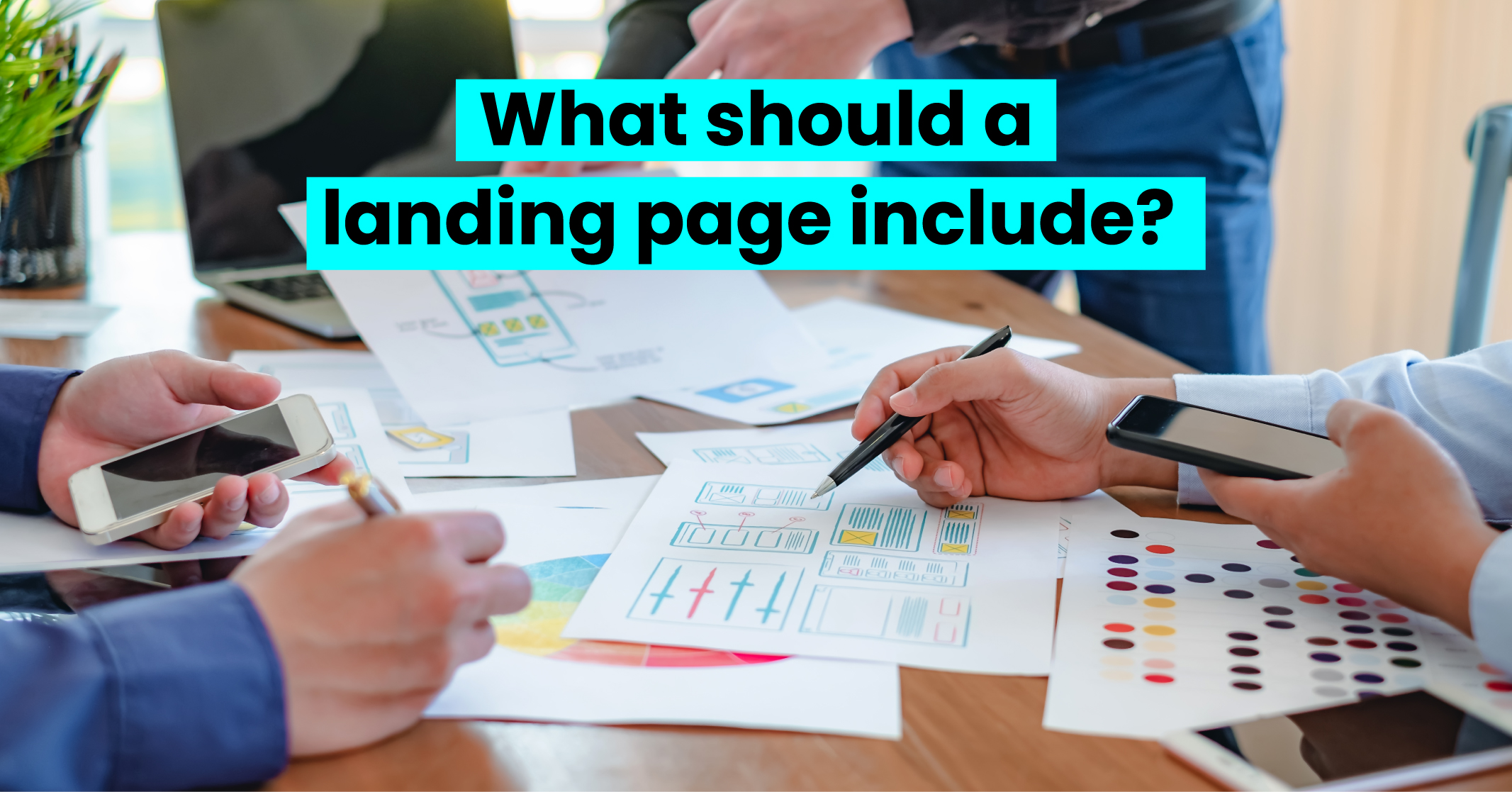
A landing page should include the following key elements:
- A clear and attention-grabbing headline that immediately communicates the value or benefit of your product or offer.
- High-quality images, videos, or graphics that showcase your product and capture the attention of visitors.
- Clear and concise text that highlights the key features, benefits, and unique selling points of your product.
- A prominent and compelling CTA that tells visitors what action to take next.
- Trust elements such as customer testimonials, reviews, ratings, case studies, or trust badges establish credibility and build trust with potential customers.
- Social proof elements such as customer testimonials, success stories, or user-generated content demonstrate that others have had positive experiences with your product.
- Contact information, such as a phone number, e-mail address or contact form, to make it easy for visitors to get in touch with you if they have questions or need support.
What should you not include on the landing page?
Here are some things you should not include on a landing page:
- Avoid including a navigation menu that allows visitors to navigate away from your landing page.
- Eliminate any content or visuals that are not directly related to your product or offer.
- Keep your form fields concise and only ask for essential information. Long, complicated forms can be off-putting and deter visitors from completing the desired action.
- Having multiple offers or CTAs can confuse visitors and dilute the primary objective of your page. Focus on guiding visitors towards one specific action.
- Avoid overwhelming visitors with large blocks of text. Instead, use concise and scannable content that highlights key points and benefits. Break up text with headings, bullet points and visuals to make it more digestible.
- Minimise external links that lead visitors away from your landing page. The goal is to keep visitors engaged and focused on the conversion goal. Save additional information, resources, or external links for a thank-you page or follow-up communication.
What are 3 of the key elements to include on a landing page?
When designing a landing page, three key elements should be included to maximize its effectiveness:
- Compelling Headline: A strong and attention-grabbing headline is essential for capturing the visitor’s interest and conveying the main benefit or value proposition of your offer. It should be concise, clear and communicate the unique selling point or solution that your product or service provides.
- Clear Call-to-Action (CTA): The call-to-action is a crucial element that directs visitors towards the desired action you want them to take, such as making a purchase, signing up, or requesting more information.
- Persuasive and Concise Copy: The copy on your landing page should be persuasive, concise and focused on highlighting the key benefits and features of your product or offer.



LEAVE A REPLY