


I hope you enjoy reading this blog post.
If you want to get more traffic, Contact Us


Click Here - Free 30-Minute Strategy Session
Be quick! FREE spots are almost gone for this Month. Free Quote
What’s the first thing that comes to your mind when you think of ‘website design’?
Do you think of stunning graphics?

Click Here – Free 30-Minute Strategy Session
Be quick! FREE spots are almost gone for this Month
Effective use of colors that are consistent with your brand image?
Modern design elements such as sliders that carry hi-resolution images that are sure to catch the visitor’s attention?
Let’s just say that you are not wrong.
However, this article aims to cover website design from a completely different perspective.
The concepts and ideas discussed here revolves around two critical factors: Usability and Utility.
All said and done, it’s your user that wields the all-powerful mouse, and he is the one who decides where to click.
Therefore, it’s only logical that ‘user- centric design’ becomes the foundation of all your web design principles .
The ultimate objective of this approach is to come up with sophisticated design decisions that will make it easier for your visitors to perceive the presented information in a desired manner.
As you read on and learn more about each of the principles, you might find that they are not the most optimal ones, and they might not even be perfect.
But hey, that’s the magic of heuristics, isn’t it?
If web design has to be ‘user centric’, then the web design principles must be deeply rooted in a clear understanding of the user behavior.
Over the years, industry experts are able to observe specific patterns that users demonstrate while interacting with websites.
By carefully examining these patterns, we are able to predict how web users are likely to behave when presented with a web page.
So before we examine the web design principles, it’s imperative that we have a clear understanding of user behavior.
Let’s face it.
Your visitors don’t expect your site to be a modern art marvel. They are not there to enjoy a piece of art.
They’d rather be in a museum if that’s what they wanted.
What they want is information and that’s stored in content.
And so long as they find what they want, they will be happy to compromise on the design.
Internet is full of examples of sites that have not-so-great design but still drive high traffic by the sheer quality of their content.
By quality, I mean content that’s credible, relevant, and specific.
While going through a web page, a typical user scans it looking for ‘content anchors’ that send signals about the quality of the content.
These signals could be keywords, images, or just about anything that’s relevant to what they are looking for.
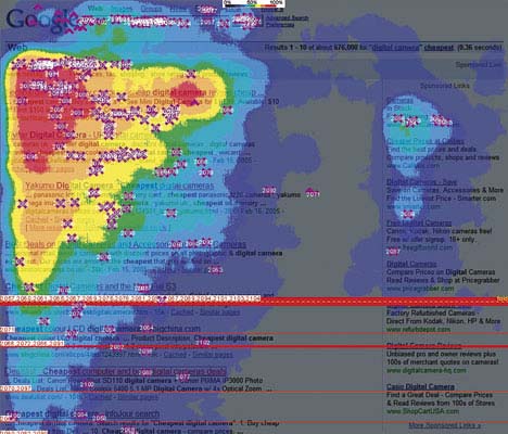
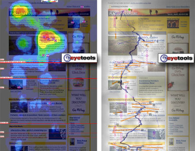
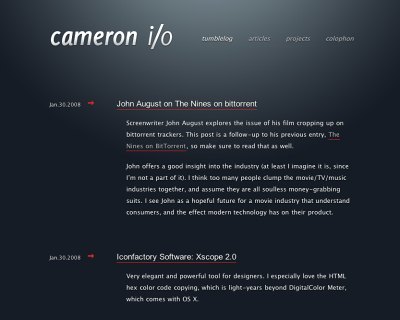
Take a close look at the images below. You will find that the user has actually stopped reading a sentence midway.
Why? He has already decided whether or not this page is what he’s looking for!
Don’t expect your users to leisurely browse through your site on a Sunday afternoon.
For all you know, they might be on their way to the office negotiating peak hour traffic!
If your site is high on cognitive load and low on intuitive navigation, your users will abandon your site and continue with their search.
While scanning a web page for information, users don’t follow a logical path.
They don’t follow a particular sequence of going from one section to another.
Instead, what they do is known as ‘satisfice’. That is, they pursue a course of action that satisfies minimum requirements.
So what does this mean to you? Just understand that your users will latch on to any section of your web page that remotely caters to their need.
If your user finds something that might lead him to what is looking for, there’s a high chance that he will click on it… immediately.
Take a look at a couple of screenshots that depict a typical scan process.
Like in most aspects of life, your users would rather trust their own intuition than logic and reason.
They just don’t care about the organized manner in which the information is provided.
They’d rather figure it out for themselves as to what works best for them!
You might ask, “Who doesn’t want to be?”
Well, when it comes to deciphering what is it that they want to control, you’ll find that it’s only reasonable.
They don’t want annoying pop-up windows unless they asked for it.
They want to go back to the previous window, or maybe even the search engine results page, when they click the back button.
So make sure that you don’t impose what your users will see on a page. Let them decide what they want.
Armed with the knowledge of user behavior and behavioral patterns, we can now examine each of the 10 principles in detail.
Are you ready?
Your website should not be a maze and require your visitors to solve puzzles!
Everything, from site navigation to the content, should be obvious and self-explanatory.
Your visitors come to your site seeking not only information, but also expert advice.
Don’t put them in a situation where they will be making decisions based on pros and cons, or comparing your product with your competition.
Another stumbling block is navigation. Is your site structure intuitive?
Does it require the user to think logically and conclude how to move from your home page to an internal page?
A simple site structure that’s easy to follow assisted by visual clues and internal page links with specific and relevant anchor texts go a long way.
Let’s look at a couple of websites to understand this point in a clearer way.
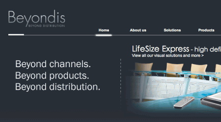
Beyondis.co.uk deals with audio-visual products that cater to both corporate and entertainment verticals.
The copy, ““beyond channels, beyond products, beyond distribution”, although powerful, leaves a huge question mark in the minds of the readers. What channels?
It’s noted from the observed pattern of readers that they follow the “F” pattern.
That is, the same pattern as you would write the letter F. First you draw the vertical line, followed by two horizontals.
Going by that pattern, the copy is what the visitor will first read and will instantly try to figure out what it’s all about.
A simple tweak to this would be to interchange the positions of the copy block and the image that shows an AV product.
Once you have seen the image first, it becomes easier to understand what the copy is all about.
Take a look at the next example.
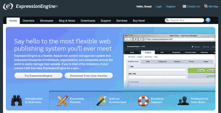
The structure used here is very similar to the previous example. However, a very direct copy gets to the point straight away.
No question marks in the minds of the readers whatsoever.
What’s more, with easy instructions and specific choices between trying the service and downloading a free version, the site makes it very easy for the reader to make a decision. Smart.
So remember – keep your communication, both visual and textual, as simple as possible.
Your readers should figure the idea out in the shortest possible time.
Once you have created the initial impression, you then go on about explaining the features, benefits, and how to get them.
If you are offering a free trial, or your website requires a registration, you should make the process as short as possible.
And the only way to do it is to require minimal details.
It’s you who needs this visitor to try your service. Your visitor has a dozen of other options. So don’t let him go. If you want him to try your service, make sure that he can do it through as fewer actions as possible.
By asking your visitors to share private information such as email address even before they try your service, you will come across as a pushy salesman who cannot be trusted.
They’d rather walk away than try your service.
In fact, many studies have shown that users are willing to share their details once they have tried your service because they know exactly what they are in for.
If your site does require a registration, keep the fields within the form to a bare minimum.
Look at the example below.
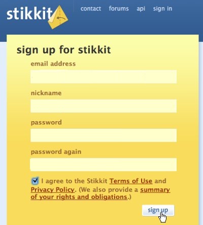
This is a perfect example of a registration form with minimal fields.
Another good idea is to allow your visitors to sign up using their social media or Google accounts.
In short, avoid registrations as much as possible. If you must have a registration or subscription, make it as easy as possible.
Modern websites are able to present a variety of information within a single page by using both static and dynamic content.
This makes it easy for the visitor to lose focus and ends up scanning the whole page. And that leaves him with a lot of questions.
Remember, the idea is to have zero questions.
When you present just the right amount of design elements and text, you are able to control your visitor’s attention in a much more effective way.
Don’t give them too many options and guide them to the section of the page that you want them to focus on.
Here’s a great example.
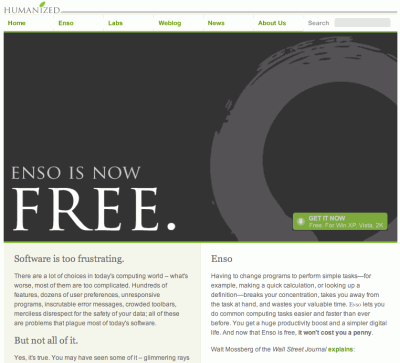
This page uses the principle of focus to perfection. Observe how design of the page drags your attention towards “Free”.
Once they have your attention to the most important part, you are then made to move towards more information about the product.
A subtle visual clue then takes you to the section where you can download the software.
No matter who the reader is, they are bound to follow this sequence.
Absolutely brilliant.
By directing the users’ attention to desired sections of your page, you are making it easier for them to navigate.
And the most important point is they aren’t answering any questions.
This makes them feel comfortable as they know where exactly they are and where exactly they will be moving.
This in turn fosters a great deal trust.
Another way of making it easier for your visitors to make a decision is to clearly present them with the options they have.
However, you must keep in mind the other points discussed earlier in the article.
Present them with as few options as possible, and each option they have must lead to a distinct page or service.
You could use different design and textual elements to differentiate one option from the other so your user knows exactly which trail to follow.
Again, keep it simple and do not confuse.
Let’s take a look at an example.
In this webpage, it becomes very clear to the visitor that there are nine clear options that are easily distinguishable from each other.
All the options are spread out in a clean layout. There’s no clutter!
There’s absolutely no right or wrong way to achieve this.
As long as your visitors are able to clearly understand the ideas expressed on the page and feel comfortable with navigating through the site, you are doing well.
Earlier in the article, we learnt about how visitors to your site scan the content as opposed to reading it.
Effective writing is all about understanding this behavior.
There are clear indicators as to the types of textual content that readers will ignore.
Promotional writing is a big no no. The moment your readers come to know that you are selling something, they turn completely off.
Long text blocks that make for heavy reading will be totally ignored.
Any content that’s considered as flowery and exaggerated will not be read.
Technical jargon, marketing terms, clever word plays that are often a part of advertising copy, and all other ‘indirect’ approach should be avoided.
Take a look at this example of effective writing.
No beating around the bush. A simple copy that’s not plain by any stretch of imagination.
A benefit, cost-effective service that everybody loves.
Follow these time-tested tips effective writing.
If you could recall, the first of the several user behaviors we discussed is ‘Content Trumps Design’.
We learnt how users will ignore design as long as they find the information they are looking for.
Going a step further, it should also be noted that a simple, clean design that is free of clutter makes it easy for your visitors to navigate through the site and helps them to get to the section of the website they want to be.
Also, referring back to the principle of focus, it becomes easier for you to take control of your visitor’s attention with fewer design elements and a cleaner layout.
Here’s a great example of website design that’s simple and sophisticated.
As you can see, the visitor will not have to think much before choosing the section to click.
Most website designers are afraid to leave empty spaces within a page.
Contrary to the popular belief that it makes your page look thin in terms of content, it actually highlights the content that’s surrounded by white space.
Every time your reader perceives the content as minimal, the cognitive load is also relatively lower and this, as we learnt in the earlier sections, is the ideal scenario.
Another advantage of having white space in your website design is that it clearly creates a visual boundary between various sections of the page. This results in a clean scannable layout that readers love.
Just look at the example below.
Notice how the website leverages white space as a principal design element to bring the focus on the minimal content that’s easy to read.
So what is ‘Visual Language’?
Visual language comprises of elements such as typography, colors, symbols, and such secondary communication tools that can be effectively deployed to complement textual, and graphical communication.
Although the history of this model of communication can be traced back to pre-historic times, it gained significance with the advent of GUI (Graphical User Interface).
According to this model, communication can be categorized into three distinctive phases:
This element of visual communication deals with the structure that’s clear and consistent. Consistency in terms of the fonts, symbols, and other visual cues are of paramount importance.
Emphasis should also be placed on screen layout and navigation.
This aspect of visual communication deals with making the most of available visual elements. It includes:
Simplicity: Usage of elements that are absolutely necessary to achieve a clean and clutter-free interface.
Clarity: Every component of communication should be clear and free from ambiguity.
Distinctiveness: The line divides various communication must not be blur and important properties should be easily distinguishable.
Emphasis: The focus should be on the most important elements of communication and they should be clearly highlighted.
Every measure should be taken to ensure that the information that’s presented must match the user’s capability.
Some of the factors that play an important role are readability, symbolism, typography, texture, and color.
The industry best practice is to use a maximum of 3 different fonts with 3 different point sizes.
Further, it is also advised that each line should not contain more than 18 words or 50-80 characters.
In a world that’s powered by innovation and constant improvisation, sticking to conventional design can be viewed as boring. However, this is not always the case.
And certainly not with website design.
Imagine going to the local supermarket only to find that they have changed the product placements all of a sudden.
Until now you knew exactly where your favorite cornflakes was. But not anymore.
Well, what your readers will go through is somewhat similar. They are used to a certain web design and layout.
Once that’s disrupted, they might as well go to another site that still follows the design that they are familiar with.
The key here is to follow your users’ expectations.
As rule of thumb, you must innovate only when you are totally convinced that the new idea is radically different from the present, and that it can drastically improve the user experience.
Never innovate just for the sake of innovation or because it’s fashionable.
The importance of testing cannot be simply overstated. They offer valuable, often priceless, insights as to the performance of your website.
While testing, three factors are of paramount importance:
Timing: Always test early in the project.
Scope: Always conduct a thorough test. Partial tests are as good as not testing.
Reason: There is no one-size-fits-all approach to web design. So you must include local reasons such as layout requirements, stakeholders’ specifications and budget.
Some points worth pondering over:
Testing a single user completely gives more information than testing 100 users partially.
Also, testing one user at the beginning of the project gives more insights than testing 50 users towards the end of the project.
Always keep in mind that errors are more frequent during the initial stages of requirement analysis and design, and are more expensive and complicated to fix towards the end.
Testing requires repeated iteration. Once you have tested your design and fixed the flaws, be sure to test again.
For all you know, the flaw you fixed could be hiding another flaw.
Usability tests are most useful. They either point to existing errors or indicate absence of design flaws.
Just like how a writer is unsuited to proofread and edit his own write-up, a coder is unsuited test his own code.
So it’s always advisable to get someone else to test your codes.
You can clearly after going through all the 10 principles that there’s far more to website design than just coming up with layouts and graphics.
With a clear understanding of your visitors’ behavioral patterns, you can design a website that will make it easy for them to navigate to the specific sections of your website.
The ultimate objective is make sure that the usability factor of your website is high with respect to your users, and the utility factor is high with respect to the relevancy of their search query.
The ball is in your court now to try out these ideas and let us know how it worked out. I’d also love to hear any questions, comments, or suggestions you might have.
Feel free to use the comments section below.
Be quick! FREE spots are almost gone for this Month


LEAVE A REPLY