
I hope you enjoy reading this blog post.
If you want to get more traffic, Contact Us


Click Here - Free 30-Minute Strategy Session
Be quick! FREE spots are almost gone for this Month. Free Quote
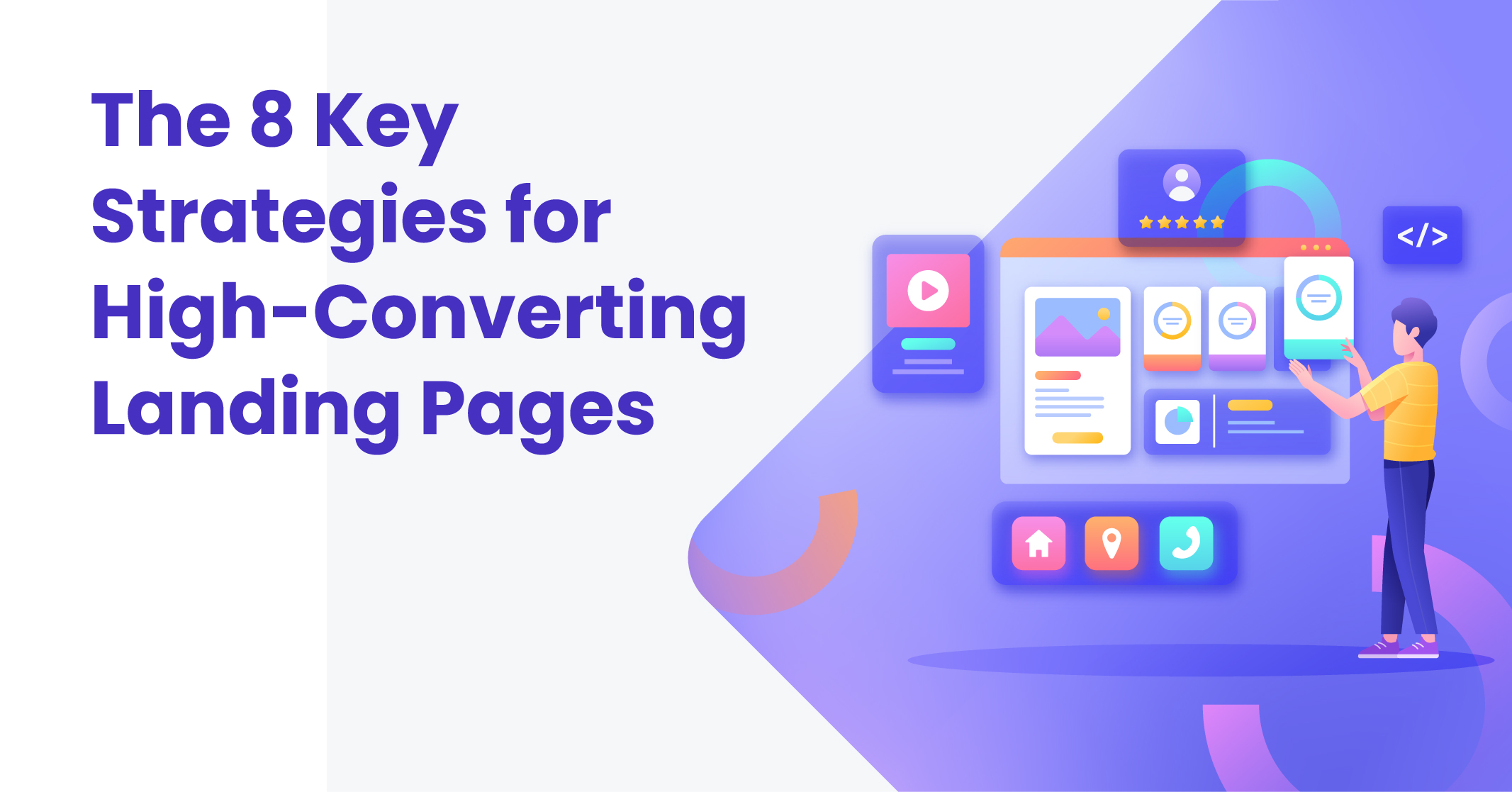
Are you curious about the secret behind highly converting landing pages? It’s a question that crosses the minds of many online marketers, especially when they’re just starting. But fret not, I have the answers you seek. In this blog, I’ll provide you with examples, tools, and tips to help you create landing pages that yield impressive results.
The potential of successful landing pages to generate substantial revenue is undeniable. Conversion Rate Experts, for instance, managed to generate a staggering $1,000,000 for Moz using a single landing page, an enticing call to action, and a few well-crafted emails. And that’s not all. The Entrepreneur’s Handbook believes that a well-executed landing page is akin to a license to print money.

Click Here – Free 30-Minute Strategy Session
Be quick! FREE spots are almost gone for this Month
Feeling inspired by these success stories? Fantastic! Because this comprehensive guide will equip you with everything you need to kickstart your journey, including an understanding of landing pages, conducting effective market research, designing captivating landing pages, harnessing the psychology of colour, and techniques to boost your landing page conversion rate.
So, without further ado, let’s delve into the world of high-converting landing pages.
Learn More: Product Landing Pages: Inspiring Designs and Expert Tips
Landing pages are crucial webpages in digital marketing that aim to prompt specific actions from visitors, such as signing up for a newsletter, capturing leads, making purchases, or attending events. They serve as vital touchpoints to engage and convert potential customers.
While marketers invest considerable time and resources to drive traffic to their landing pages, it becomes futile if these destinations fail to captivate and guide visitors through the sales funnel effectively.
That’s why it’s essential to focus on creating high-converting landing pages. However, it’s important to note that designing an exceptional landing page goes beyond simply adding visuals, text, and a call-to-action button. It requires a strategic approach, and in this article, we’ll explore the art of crafting landing pages that yield impressive results.
To provide a better understanding, let’s also delve into some notable landing page examples that illustrate these principles in action.
Learn More: Generating Hyper Local PPC Landing Pages
According to HubSpot, nearly half of marketers create new landing pages for each campaign. This is because landing pages play a crucial role in facilitating specific conversion actions, such as user opt-ins. However, there are several other compelling reasons why focusing on landing page design is essential for your online business.
Here are the key benefits of using targeted landing pages for your marketing campaigns:
To simplify the process of building effective landing pages, consider utilising a reliable landing page builder, which can streamline the design and optimisation tasks.
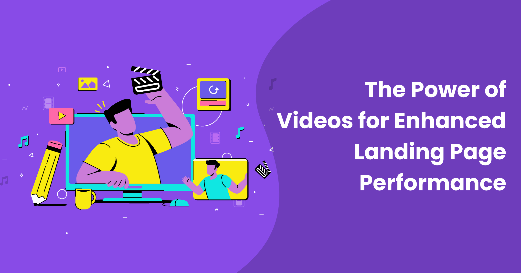
If you’re aiming to create high-converting landing pages, incorporating videos can be a game-changer.
Here’s why:
Moreover, videos are particularly valuable for showcasing how your product works, especially if installation or configuration is involved. Take Slack, for instance, where a video demonstrates the software’s capabilities and guides usage.
To simplify the process of incorporating videos into your landing pages, consider leveraging a reliable landing page builder, which can streamline the design and integration of video content.
The optimal length of your landing page copy depends on your specific goals and objectives.
In the digital marketing industry, it’s common to see long-copy landing pages, especially when the aim is to highlight product or service benefits and close a sale.
On the other hand, if your goal is to capture someone’s email address in exchange for a free report, it’s advisable to keep the copy concise. This approach enhances the user experience, increases opt-in rates, and boosts form completions.
A prime example of a short-copy landing page is QuickSprout, which achieves a high conversion rate by simply requesting visitors’ URLs.
Ultimately, it’s recommended to test both long and short-copy formats and evaluate their performance to make an informed decision that suits your specific needs.
While some sources suggest that longer landing pages tend to convert better, it’s crucial to ensure proper formatting and structure for optimal readability and engagement.
To streamline the creation process of your landing pages, consider utilising a reliable landing page builder that offers a variety of templates for different purposes. This can help you create professional and effective landing pages without extensive design or coding knowledge.
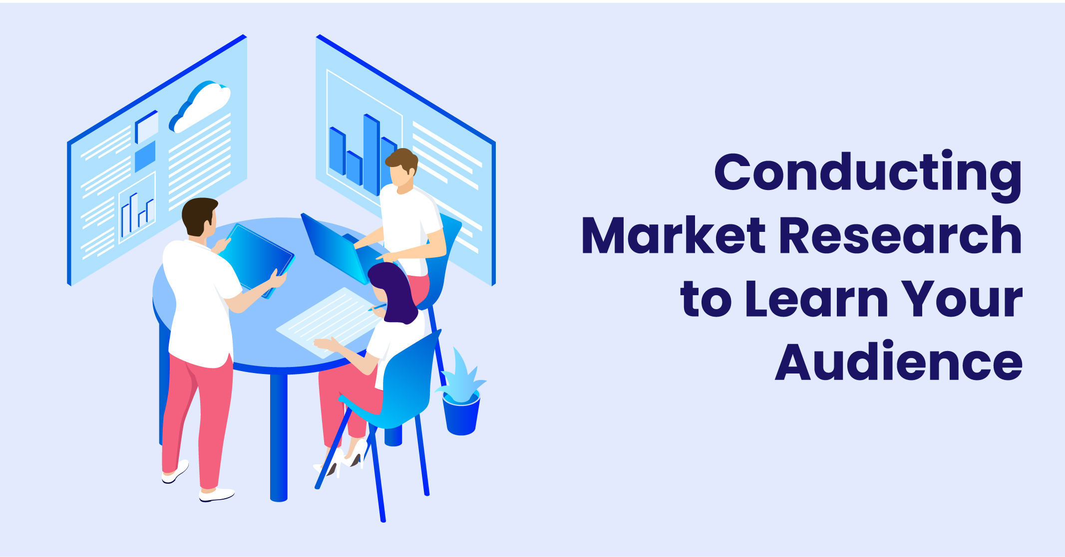
Market research forms the foundation of every successful landing page by enabling you to gather crucial information about your target market and customers. This valuable data helps create value and deliver a desirable customer experience.
Without conducting market research, you lack insight into the existence of an audience for your product or the level of interest in your chosen topic.
Let’s consider an example: If you’re planning to launch a product targeting a project manager, assessing the demand within that specific area becomes essential.
By conducting market research, you can gain insights into the current demand for project management solutions and identify opportunities to effectively meet project managers’ needs.
To create a high-converting landing page, thorough market research is essential. Here’s a simplified step-by-step process:
To simplify the process of creating your landing page, you can rely on a reputable landing page builder that offers landing page templates and helps your present information clearly and concisely. This can be especially helpful if you’re not confident in designing the landing page yourself.
Social media is a valuable source of customer insights and feedback. By monitoring your customers’ conversations on social media platforms, you can gain valuable information about their perceptions of your brand and their preferences.
Engaging in direct conversations with prospects and customers on social media allows you to extract useful data about their needs, preferences, and the overall market landscape. This not only helps you gather insights but also creates a positive brand experience for users.
While social media can be overwhelming, it’s important to focus your efforts on the platforms where your customers are most active. You don’t need to be present on every platform. Platforms like Quora can also serve as useful tools for conducting market research.
Understanding keyword intent goes beyond surface-level keyword research and delves into understanding the purpose behind user searches and how it relates to your target audience.
Google Keyword Planner can help uncover related keywords and their average monthly search volumes, providing valuable insights for market research. For example, searching for “ab training” revealed long-tail keywords like “core workouts at the gym” with higher search volume and low competition.
While optimising content with such keywords can improve rankings, it may not yield high conversion rates without a clear opt-in process. This is because the focus should be on optimising for users who are genuinely interested in purchasing the product.
The structure of a high-converting landing page plays a crucial role in optimising conversions.
Let’s break it down into key elements:
To build effective landing pages, you can leverage tools such as Unbounce, OptimizePress, PopUpDomination, OptinMonster, Instapage, Leadpages, and Getresponse. These tools provide landing page builders, A/B testing capabilities, and lead capture functionalities.
When designing your landing page, prioritise a clear user interface and experience, ensuring it is mobile-friendly and easily navigable. Use clean and legible fonts, and consider adopting the A.I.D.A. model (Attention, Interest, Desire, Action) to guide your content strategy.
The psychology of colours explores the impact that different colours have on human emotions, perceptions, and behaviours. Colours can evoke certain feelings and associations, making them a powerful tool in marketing, branding, and design.
For example, warm colours like red and orange are often associated with energy, passion, and excitement, while cool colours like blue and green can evoke feelings of calmness and trust.
Additionally, cultural and personal experiences can influence individual responses to colours. Understanding the psychology of colours can help businesses strategically choose colours that align with their brand personality, attract their target audience, and effectively convey their desired message.
Choosing the right background colour for your landing page is crucial for optimal conversions. It is important to ensure that the background colour does not hinder the readability of the text. If using a deep colour, make sure there is sufficient contrast with the text.
For instance, Mind Tools effectively uses contrasting orange and blue colours to highlight key information. Milani Cosmetics opts for a clean white background, allowing the vibrant product images to take centre stage.
Alternatively, a minimalist approach with a plain white background can also be successful, as seen on CrazyEgg and Copyblogger Media.
It is important to avoid linking from your landing page, particularly when your goal is to capture email leads. However, if linking is necessary, it is recommended to follow web conventions by using blue for underlined links and maroon for visited links.
Ultimately, you can be creative with your landing page and use colours that resonate with your audience, whether it’s red, green, or any other colour that proves effective in driving clicks and achieving your goals.
Learn More: Google’s Traditional 10 Blue Links
When selecting colours for your call-to-action buttons, it’s important to consider the meanings associated with each colour and how consumers perceive them. For instance, pink represents unconditional love and is often used to target women due to its feminine connotations.
Similarly, the orange evokes warmth and happiness. However, even if your target audience is not exclusively female or you’re not in the dating industry, using pink or orange in your call-to-action can still be effective.
Blue, on the other hand, is associated with trust and peace. If you offer digital products like eBooks, software, plugins, or themes, using blue can help establish trust and loyalty among customers.
Many online payment merchants use blue for their call-to-action buttons to provide a sense of security and enhance the user experience, encouraging more customers to act.
By applying the C.O.N.V.E.R.T.S. method, you can significantly improve your conversion rate. This method encompasses all the factors we’ve discussed so far, making it easy to remember and implement.
To achieve the best results, it’s important to optimise your copy and call-to-action buttons. Follow the K.I.S.S. principle, which stands for “Keep It Simple, Stupid.” This means staying focused and on-topic on your landing page.
Given the short attention span of the average consumer, estimated to be just 8 seconds, it’s crucial to capture their attention immediately and engage them effectively.
Calls to action (CTAs) are ubiquitous and serve the purpose of guiding consumers to the next stage of the conversion process. Whether it’s “Shop Now,” “Sign Up,” “Try It,” “Contact Us,” or “See Our Video,” CTAs are meant to prompt action.
Remember the K.I.S.S. principle we discussed earlier? Apply it here as well. Keep your CTAs simple and focused. It’s best to emphasise only one CTA on your landing page, as demonstrated by this excellent example from Promo. By maintaining a clear and singular CTA, you can enhance the effectiveness of your landing page.
To optimise your call-to-action (CTA) button, follow these guidelines:
By implementing these strategies, you can enhance the effectiveness of your CTA buttons and encourage higher conversion rates.
When creating high-converting landing pages, it’s important to offer something valuable to your visitors in exchange for their desired action.
Here are some tips for using offers effectively:
For example, a landing page offering a brain-boosting eBook might use the following structure:
Headline: Supercharge Your Brain with BrightMind Subhead line: Sign Up for Our Free eBook and Get Instant Access to Brain-Boosting Secrets Body Copy: Unlock your brain’s full potential with BrightMind. Our FREE eBook provides valuable tips and strategies to enhance mental clarity and memory.
When examining examples, it’s important to consider both effective and ineffective approaches. AAA Life Insurance Company’s landing page has several issues, such as requesting excessive information and featuring multiple CTAs and jargon.
On the other hand, United’s “Explore” page for their credit card offers a clear and compelling offer. The visual cues and bonus air mile offer encourage users to spend a certain amount within a specified time frame.
By applying these principles and analysing successful examples, you can create persuasive landing pages that drive conversions effectively.
Learn More: Local Landing Pages
When aiming to create landing pages that lead to conversions, it’s important to simplify the page and minimise distractions.
Here are some tips to put this into action:
Examining examples, Oracle’s landing page offers numerous clickable options, which can easily divert visitors’ attention. On the other hand, Salesforce’s landing page demonstrates effective simplicity. It eliminates a navigation bar, places administrative links at the bottom, and uses a concise form with a clear and compelling CTA.
To encourage visitors to provide their details or Very Important Attributes (VIAs), it’s essential to provide compelling reasons for them to do so.
Here are some tips to implement this strategy effectively:
When it comes to copy for print or display ads, the focus is often on capturing attention with clever, funny, or outrageous headlines. However, on your webpage, the situation is different. Visitors have already been funnelled to your site, and now the goal is to convince them to stay and explore further.
Within a split second, visitors will decide whether to continue playing their game of “Words with Friends” or stay on your site to find out more. To keep them engaged, it’s crucial to communicate in plain language what your site is all about.
It’s important to consider that there are still users who surf the web on lower-resolution monitors, such as 800 x 600. However, the most popular screen resolution worldwide is 1920 x 1080. This means that the visual experience you have on your HD monitor may differ from what your customers see.
To ensure effective communication, it’s crucial to keep the most essential parts of your message in the centre top of the screen, with supporting content below.
The essential elements that should be prioritised include your logo, headline, call to action, and a supporting visual. By placing these elements prominently, you can capture the attention of your visitors and guide them towards taking the desired action.
To implement this strategy:
When it comes to creating landing pages that convert, it’s important to avoid distracting elements and cluttered designs. Instead, follow these tips:
Humans tend to value things more when they see that others have already approved of them. That’s why it’s common for websites to showcase social validation through various means, such as:
If you’re just starting and don’t have much social proof yet, even a couple of quotes from beta or alpha users, or even friends and family, can demonstrate to site visitors that others have found value in what you offer.
To effectively incorporate social proof:
By showcasing social proof in a clear and visually appealing manner, you can instil confidence in your visitors and encourage them to trust and engage with your offerings.
An effective landing page leads potential customers through the sales process, assisting them in finding relevant information quickly and motivating them to act through a clear call-to-action (CTA).
Converting visitors into customers through landing pages is a blend of scientific techniques and creative skills. Utilising tools like Unbounce, you can craft landing pages that resonate with your audience by understanding their preferences and addressing their specific needs.By adopting conversion landing page best practices, consistently testing, and refining your strategies, you can create the best landing pages that not only drive conversions but also establish trust and foster loyalty among your target audience.
Begin by crafting a concise and captivating headline that emphasises the key advantage of your product, while tailoring your copy to address the specific needs and challenges of your intended audience. Incorporate visually appealing and engaging images and videos that effectively demonstrate your product’s functionality and highlight its capabilities.Don’t forget to include a prominent call-to-action (CTA) and keep your text concise and focused. It’s crucial to conduct A/B testing to determine the most effective content variations. Additionally, leverage testimonials to build trust, streamline navigation for a seamless user experience, and clearly articulate your unique value proposition.
It is crucial not to underestimate the significance of landing pages and the value they can bring to your business. While successful websites are often discussed, landing pages should not be overlooked when it comes to driving conversions.
There are various models available for creating high-converting landing pages, so don’t hesitate to experiment and find the approach that works best for your company and offer.
To begin, gain a deep understanding of your target audience and what resonates with them. Empathise with their pain points and create landing pages that offer effective solutions. Incorporate a compelling call-to-action (CTA) to prompt them to act and witness the growth in your conversions.
Be quick! FREE spots are almost gone for this Month


LEAVE A REPLY